Thursday, April 4, 2013

black botanical prints

Trendy as these are, I still love 'em.  They appeal to my love of the design themes of science geek/Steam Punk/Victorian cool kid.  Remember this beauty?  I'm also the woman who would shank somebody for a porpoise skull.  Let's pretend I don't know about the permitting issues associated with that. The skull....not the shanking.


I bought The Art of Instruction on Amazon today and can't wait for it to get here!!


Monday, March 25, 2013

painted hutch

We have this nice built-in hutch in our dining room, which we love and use a lot.  We need that storage.  But in 7 years of living in this house, I've never done anything to it, except throw all our junk there. 


The other day I got a wild hair to paint the hutch and chose Martha Stewart Plumage in semi-gloss.


 Here is the finished product, complete with keeping-it-real stuff that's stored there.  Crayons, wine glasses, DVD's, napkins....all essential mom items.


You may also notice my strange little dog portrait there.  He's from a children's book that my mother-in-law had back in the 1950's.  It was a book of pictures of ACTUAL live animals posed and dressed up in human clothes.  This is probably not PETA approved.  :)  He's a part of my favorite vignette in the house which also features a pair of George and Martha Washington silhouettes and a poster from my husband's grandparents basement.  I'm weird, what can I say?


antlers reveal

After much scraping and pulling and soaking, I finally got down to the bare skull on this 50 year old rack.  And....it was yellow. Very yellow.  Probably stained from 50 years of decaying grease since the fur and skin were LEFT ON this thing.  Gross.  I tried all kinds of whitening techniques - baking soda, hydrogen peroxide, bleach.  No luck.  Finally I threw in the towel and decided to dry brush flat, white ceiling paint over the skull to brighten it.  Good enough for me!


The screw holes were already there from the skull being mounted in the shed all those years, so I used those to screw it to the wooden plate, then put wood putty over the screws and the screw holes and painted over the putty.

I bought the wooden plate at AC Moore, stained the front and painted the edging BM Hale Navy (a sample I had laying around).  Coated it with spray poly and we were done  Not too bad.


The gallery wall is still a work in progress....


Thursday, March 14, 2013

dark powder room

Like the itch you can't help but scratch, I finally caved and painted our half bath.  The color was BM Bronzed Beige that I painted about 7 years ago.  It's not bad but somehow felt blah.  I also had practically no art on the walls and wanted a darker, more gallery look to this tiny room.  It's really tiny, like 5x8.


A glimpse into our pantry/laundry area and the kitchen.  And the paint samples on the set of cabinets that will soon come down in lieu of open shelving.  More on that later.  The ugly white tile you see there extends into the bathroom.  We'll deal with that later as well.  Probably going to cover it in Trafficmaster Allure faux wood vinyl.   

Back to the bathroom - I decided to go with a dark blue, inspired by some of these rooms.


I chose BM Mysterious and here's the progress so far...


The gems above the toilet slay me.  I downloaded them from Vintage Printables and had it printed out at Office Max.  Gotta get it framed and matted better though.  Lots to still be done in this room but wanted to give you a sneak peek....

Thursday, February 28, 2013

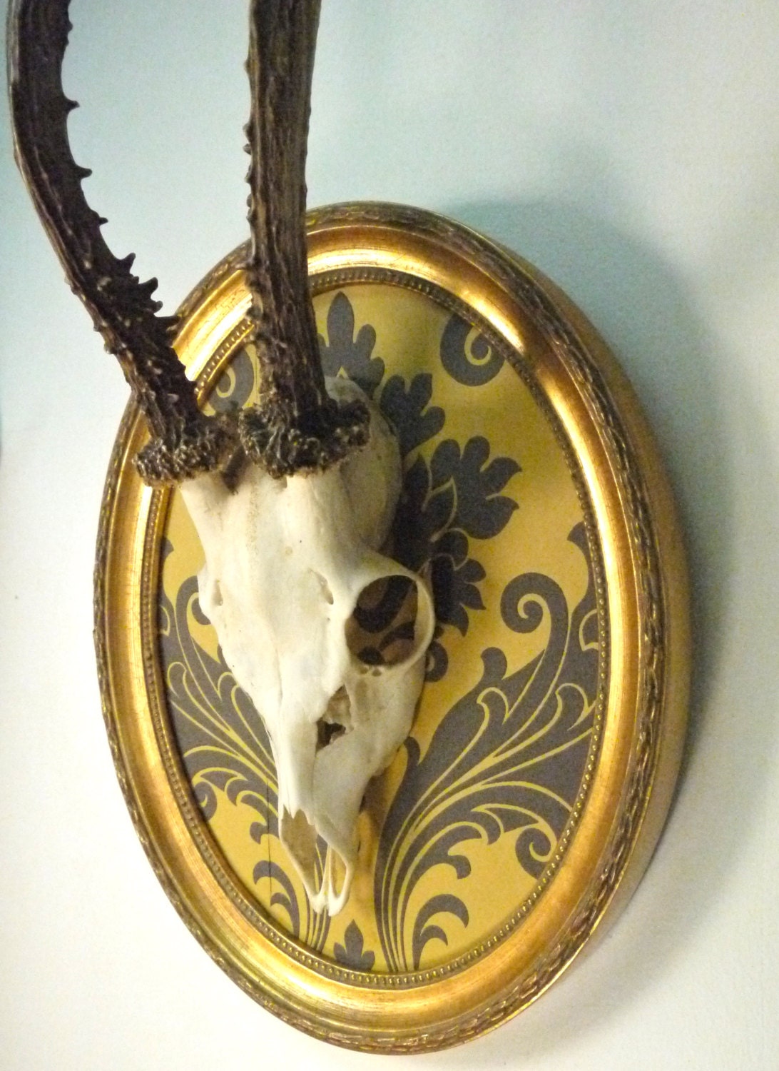
mounting a 50 year old deer rack


....and did I mention cleaning it?  Yuck.  Don't read this post if you're feeling queasy.


My husband's grandfather shot this deer about 50 years ago in western Massachusetts.  But he failed to remove the skin/fur from the scalp before he mounted the rack in the shed.  Where it had remained....until I brought it home.  After polling guys at my office about how best to clean the skull cap (a perk of working for the Dept of Fish and Game), I'm letting the skull cap soak, then pulling and scraping the scalp until it's clean.  The image above is after I scraped the FIRST layer of gunk off.  That yellow stuff is more...goo or whatever.  After scraping it all off, then I'll do a peroxide treatment to bleach it. 

I'm planning to mount it to this curvy, oval plate from AC Moore. Probably staining the front face and painting the edging BM Hale Navy.


But how to style it?  I prefer the European style where the skull isn't covered up with leather or cloth.  I like seeing the white of the skull and where it meets the antlers.  Here's a few ideas....

German Roe Deer Skull Antlers Mounted In Vintage Oval Frame


Monday, February 4, 2013

damn you sconces


probably in another world, or in another home, one might be jealous that we have wall sconces. probably. but, I despise them. they look like generic dentist office lights and make me cringe every time I walk down our hallway. they basically look like the one pictured above, but with more metal showing.

I want to replace them with much more vintagey feeling lights. some day. but then, I saw this clock on one of my favorite sites three potato four and now am thinking it could replace the evil sconce in our living room. I love it.


how much cooler would we be with this clock hanging out of our wall? much cooler.

summer...

I'm craving it. big time. feeling trapped by all this cold and snow with little bean, wren. so, I day dream about our decks when she naps.

this is definitely happening...


I'm eager to start an herb garden on one of our front decks that gets morning sunlight but tends to be more shaded. there's a chance I will not be able to find wine boxes without paying a silly amount, if so, home depot has great little crates in various sizes for a good price. like this one below for $6.50.


a move and a bedroom

readers, it has been ages since I've posted. much has happened. my husband and I moved from california back to chicago where we bought our first piece of property: a condo in Andersonville.

also, we had a baby this summer, a beautiful little girl who is already 5 months old. it's all going too fast.

the condo we moved into is newly gut rehabbed and has many fine qualities. that said, it's a little stale and needs some adjustments in the details. now that things have settled down in the land of parenting, I am starting to get that mid-winter itch to make it all better. (and I cannot ignore that desire to improve the place for when we eventually sell it).

my big focus right now, (besides day dreaming about gardening and plotting furniture purchases for our decks), is our bedroom. I am still in that very neutral, very simple ease sort of mood when it comes to decorating. I am afraid to put anything on the walls - especially in the bedroom - because I simply do not want to overwhelm the mood or find myself sick of the artwork.

here's what I am in the mood for (all thanks to pinterest)


I like the idea of this wooden headboard but hate the cliched writing. barf. and also hate how the whole thing feels a little forced. I want easy, simple, cozy. 


like this one is actually comfortable and real. and beautiful. and pretty much the best around. (clearly I am drawn to wood walls). 


I also am drawn to the idea of a bed on the floor. am I crazy? I know my husband would not go for it, but there's something so relaxed about it. 


Tuesday, January 15, 2013

gray updates and other projects

Hello, lovelies!  Sorry I'm a lazy and basically nonexistent blogger.  But there's been plenty of projects happening in my 122-year old money pit.  Wanna see?

Living Room
Thank you for all your inquiries about the final (!!!) paint color decision for the living room.  And 22 paint samples later, the winner was.....Benjamin Moore Revere Pewter.  A warm, medium gray that doesn't get washed out or blue/purple in all this sunlight. 


Still working on the gallery wall....

I celebrated the victory in the living room by embarking on four more gray-painting projects.  Oh the pain.  Here's a glimpse of the kitchen project.
 

Kitchen
The 80's oak cabinets will soon get a facelift with the perfect taupe-y gray BM Brandon Beige.  The middle cabinet, where our daily dishes and glasses go, will be replaced with open shelving.  We'll be doing paneling for the backsplash, going all the way up behind the open shelves, like Erica's.  Here's a mock-up.


More to come.....

Erin


Wednesday, April 4, 2012

scallop stencil

LOVE the stencil in this baby's room - they used THIS stencil but turned it upside down.


Monday, April 2, 2012

"No, honey, that table is just for looking at...."

This product was created for decor psycho parents. It looks way cool but really? A Parson's play table? Soon Design Within Reach will be making a kid's potty.

Sunday, December 4, 2011

still being tortured....

Okay, people, gray is winning! After 18 samples of gray paint, we thought we'd found The One in Stonington Gray by Benjamin Moore. It's in there somewhere....

The couch is gray so I wanted a warm gray to compliment it, but everything was coming out blue. We put up Stonington Gray, eager to make a decision before our holiday party. Turns out, it's ALSO blue......arrrgggg!

Perhaps hard to see here, but it makes the room look sad and blue. So we went back to our other top 2 choices, Revere Pewter and Edgecomb Gray by Benjamin Moore. We had previously put those samples on the wall and rejected them but we put 'em up again, against the blue, to see what we thought now. You can see the Revere Pewter here....

The Edgecomb Gray, to the right of Revere Pewter, barely registers. Much too white. Compared to the Stonington Gray on the walls, the Revere Pewter is a much warmer, taupe-y gray. We bought a gallon. Stay tuned, nerds.

Monday, November 21, 2011

gray paint....why do you torture me?

Our living room got a facelift this summer - new couch, new rug, reupholstered the wingback chair, and decided to repaint the walls, since the peachy-beige color was driving me nuts. We decided on gray for the walls - classic and sophisticated - something to compliment the gray couch. Little did I know, gray is a mean old cuss. Mind you, I chose the paint colors for the whole house by eyeballing a swatch on the wall and had no problems. This time I played it safe and put samples on the wall first. Thank god because after 17 paint samples (17, people!!!) - no dice. Love 'em on the swatch, loathe 'em on the wall.

Our living room is bright and gets lots of southwestern light, which apparently turns everything an early 90's hydrangea blue. Barf.

Here's the cast of hopefuls, all colored matched in Olympic low-VOC paint samples...

Benjamin Moore
Gray Owl
Horizon
Titanium
Moonshine
Revere Pewter
Coastal Fog
Edgecomb Gray
Harbor Gray
Horizon Gray
Nimbus

Olympic
Plantation Moss
Quill
Gray Ghost

Valspar
Frappe
Oatlands Subtle Taupe

Behr
Dolphin Fin


They're all gorgeous, right? Not in the glare of our bright living room. Ttoo dark, too light, too purple, too turquoise or too blah.

On the verge of defeat, willing to live with the patchwork of yuck on our walls, I went back one more time and came home with a winner - Stonington Gray by Benjamin Moore.


I've always loved it on the swatch but didn't buy a sample for this project because it seemed so blue. Not so blue on the walls apparently. Go figure. It goes to show you can never trust the swatch. Now we gotta paint this room before our holiday party - cover up the bazillion gray swatches.

More pictures to come.....